The Face — that reflects their values, mission, and personality. - David Airey
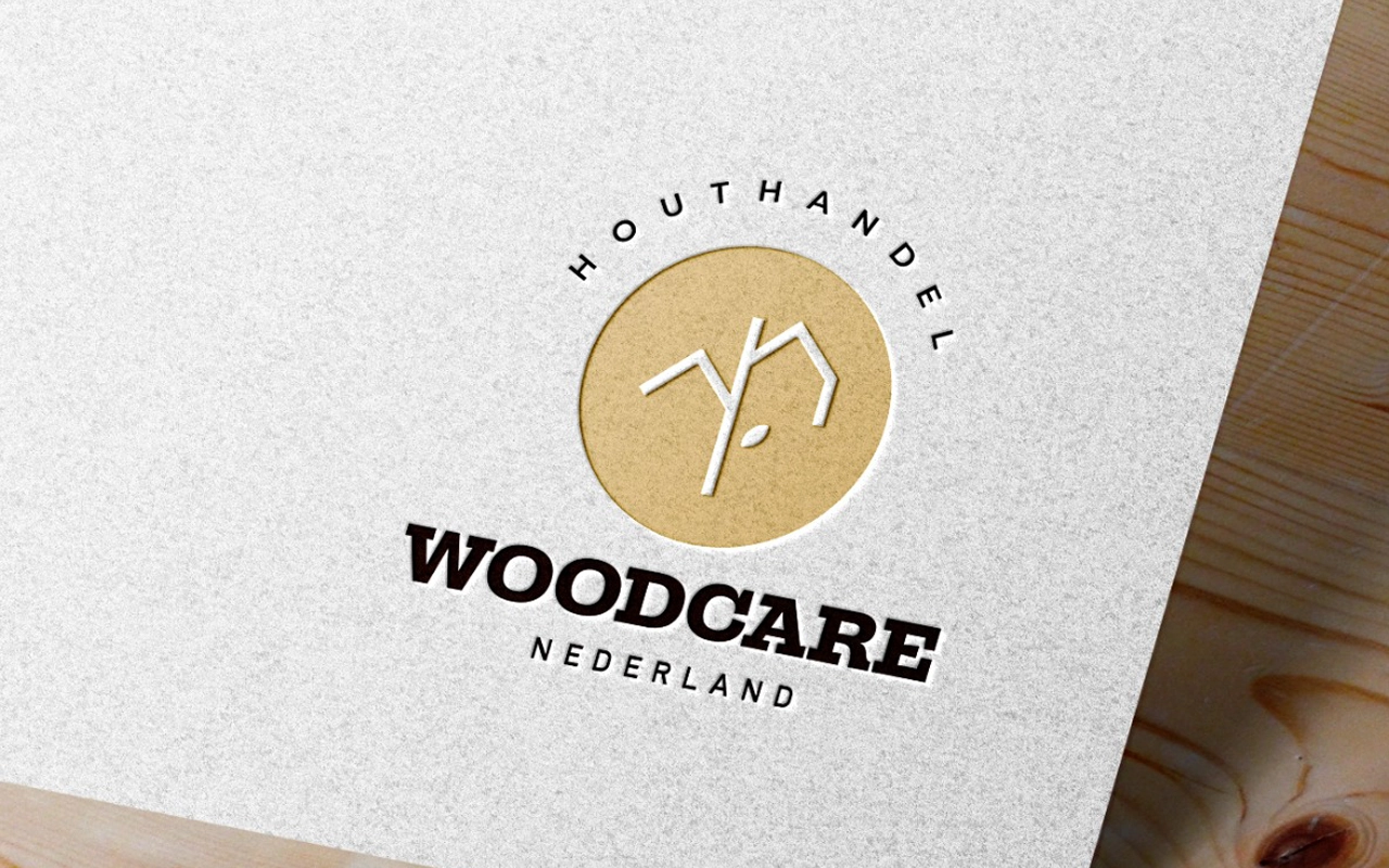
Woodcare
Wood and Sustainability
Woodcare is a company that takes pride in everything made of wood. With a big factory, they produce a wide range of products including wooden floors, furniture, and more.
The logo for Woodcare is a perfect representation of their brand. It features a round element in the back with a tree and a green leaf, symbolizing their commitment to sustainability and their love for all things wood. The round shape gives a sense of unity and wholeness, which reflects their comprehensive approach to everything they do. The tree and leaf represent growth and renewal, indicating that Woodcare is a company that is always evolving and striving to be better. Overall, the logo is a perfect blend of simplicity and meaningfulness, and it captures the essence of Woodcare perfectly.
Other options that where created as part of the free brainstorm
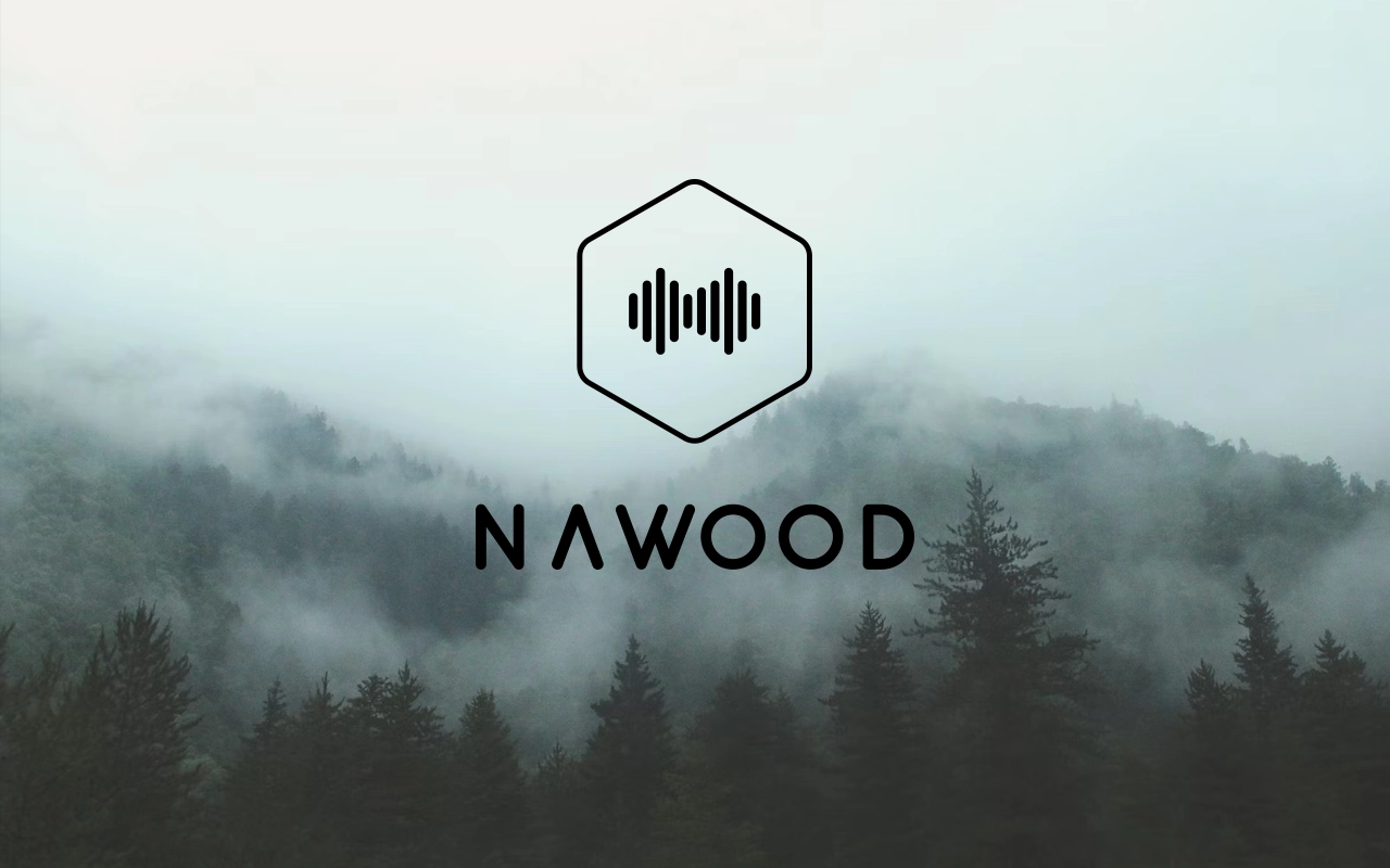
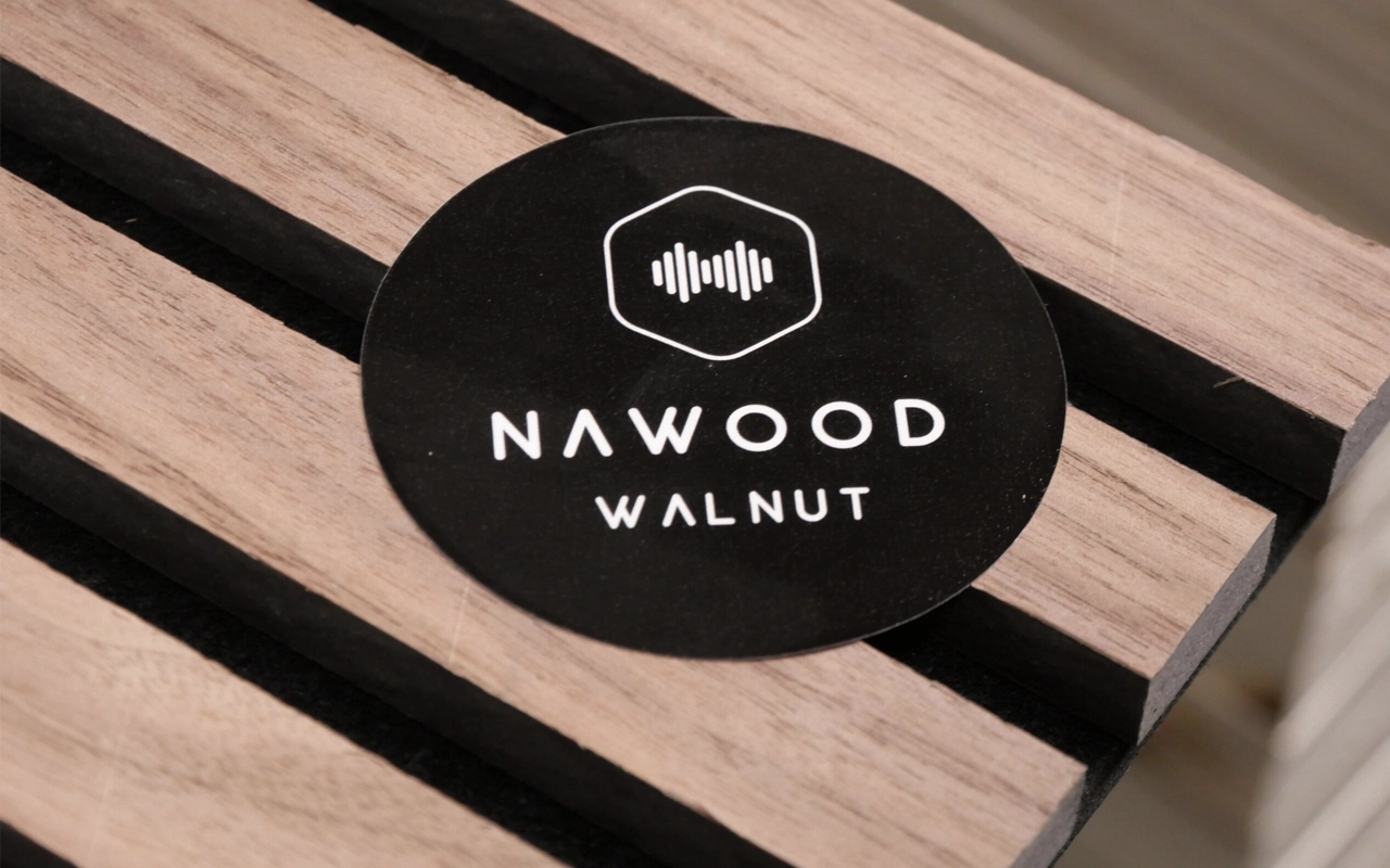
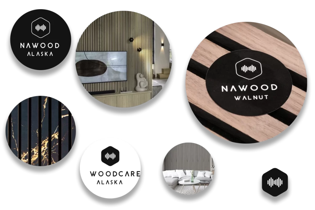
Nawood
Absorb sound
Nawood is dedicated to providing high-quality products that effectively absorb sound and enhance acoustic performance in any space.
The logo is a sleek and modern design that perfectly represents their focus on acoustic panels. It features a hexagon with sound waves in the middle, symbolizing their commitment to improving sound quality in any space.
The hexagon shape represents stability and balance, indicating that Nawood’s acoustic panels are a reliable and effective solution for any acoustic needs.
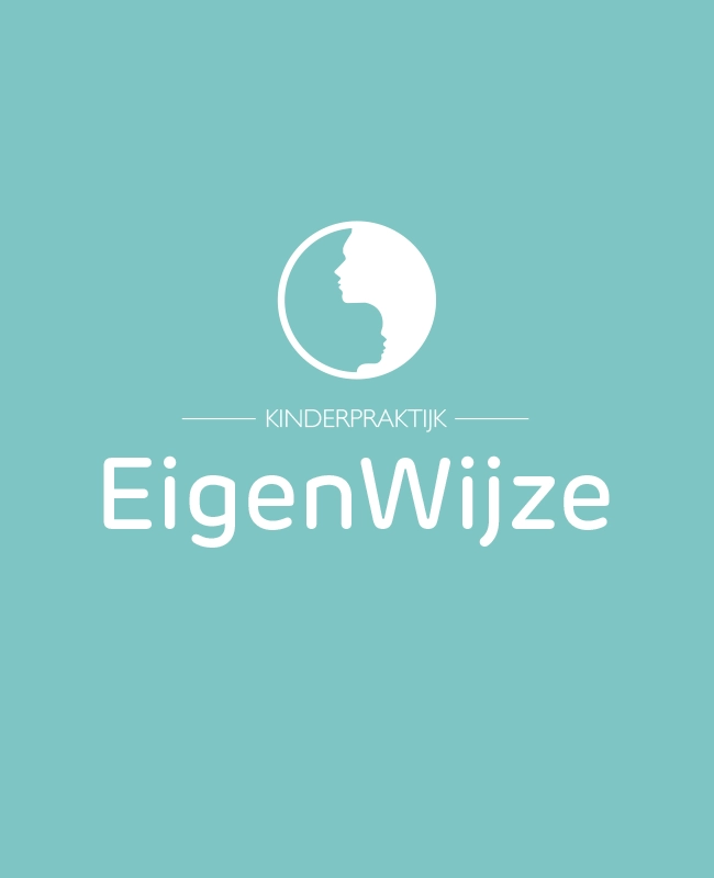
The integrated silhouette represents the connection and collaboration between the child and the practitioner, highlighting the personalized approach taken by Kinderpraktijk Eigenwijze.
Kinderpraktijk Eigenwijze offers remedial teaching and psychodiagnostic testing for children. They specialize in supporting children who struggle with learning and development in school.
Through individual guidance and assessment, Kinderpraktijk Eigenwijze helps children reach their full potential and succeed in their academic pursuits.
Go2Market
Press Play
A simple and elegant logo focusing on the speed and ease the company works for the brand
Partnering with Go2marketstrategy will help you to start with the right go-to-market plan from the start, focus on pre-selected countries and launch with the best local channel partners in each European country.
We will craft the framework of success together, having dedicated focus to accelerate sales growth in line with your commercial objectives set for Europe.
The logo represents Corsas commitment to providing high-quality parts for Ducati motorcycles, which are renowned for their Italian heritage and engineering excellence.
Corsa website is dedicated to selling high-quality Ducati spare parts to motorcycle enthusiasts around the world. Corsa specialize in providing authentic parts for a wide range of Ducati models, from classic vintage bikes to the latest models.
The Corsa website features a user-friendly interface, making it easy to find the parts you need for your Ducati motorcycle.
The logo reflect the company’s commitment to innovation and efficiency in the world of smart home. The house shape in the logo represents the idea of creating a complete smart home, with Navstar serving as the go-to spot.
Navstar is a leading distributor of smart home products in the Benelux region, offering a wide range of products that can help make your home smarter and more efficient.
Whether you’re looking to automate your lighting, control your heating and cooling, or manage your home security, Navstar has you covered.
navstar.nl
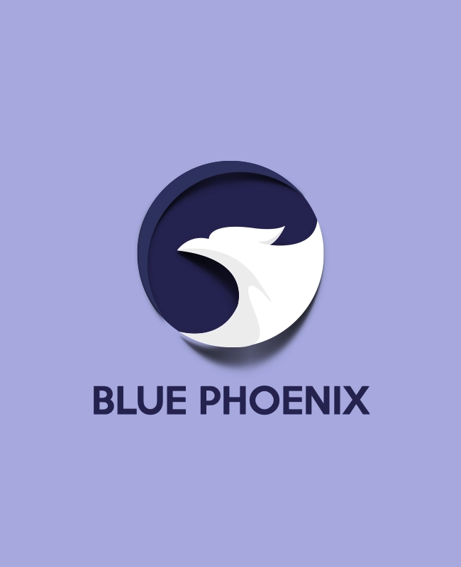
Blue Phoenix
Today and beyond
This logo is particularly relevant in the context of racial change movements, as it speaks to the need for transformation and renewal in our approach to social justice and environmentalism.
Blue Phoenix’s mission is to facilitate better investment decision-making. Better for the economy, the environment, and society. Better today, tomorrow, at the end of the century and beyond.
With the rise in the availability of types of environmental, social, and governance (ESG) data through corporate reporting, rating, and data agencies, the need for a translator between the stakeholders in the investment value chain increases. Doing that is at the core of Blue Phoenix’s business.
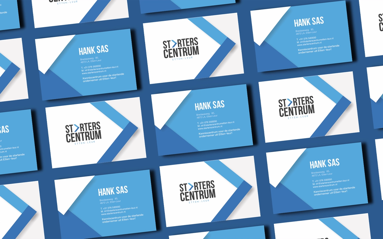
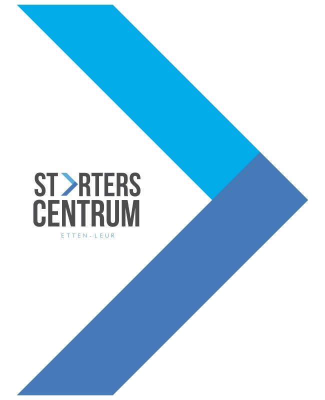
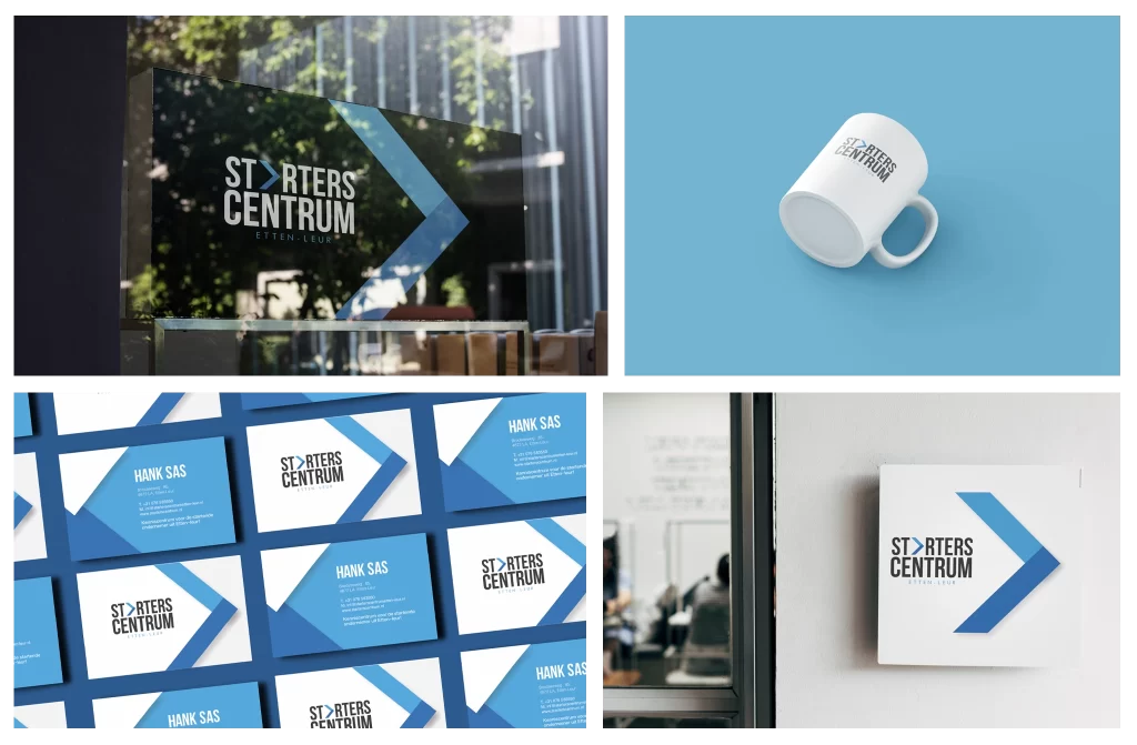
A sleek and modern arrow design in shades of blue, symbolizing speed, progress, and a great start for entrepreneurs. The arrow also points upward, suggesting growth and success for those who work with Starterscentrum.
Starterscentrum provides invaluable support and guidance to starting entrepreneurs, helping them to get their business off the ground and take their first steps towards success.
Whether you’re just starting out or you’re looking to take your business to the next level, Starterscentrum can provide the tools, resources, and expertise you need to succeed.
We use cookies to ensure that we give you the best experience on our website. If you continue to use this site we will assume that you are happy with it.Ok