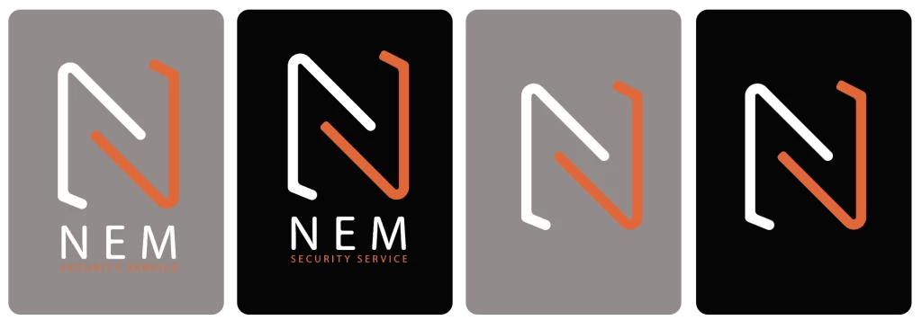
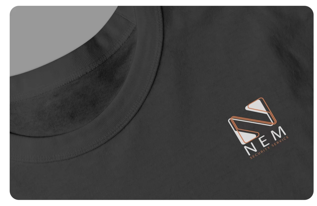
The logo designed for NEM Security Services represents the culmination of a meticulous process aimed at capturing the essence of their brand. With a primary focus on providing top-tier security staffing solutions across various industries, the client’s directive was clear: integrate the letter ‘N’ into a design that possesses visibility, particularly in low-light conditions, hence the incorporation of reflective orange hues.
Crafted in the style of distinguished emblems commonly associated with law enforcement and security entities, the emblematic logo strikes a balance between simplicity and instant recognizability. Its deliberate use of reflective orange ensures optimal visibility in dimly lit environments, emphasizing the brand’s commitment to vigilance and security, even in challenging conditions.
A multitude of diverse logo options
Dedicated to fulfilling the client’s vision, I generated a multitude of diverse logo options, each offering unique variations while staying true to the core brand identity. Over 20 distinctive designs were meticulously crafted, with the ultimate selection aligning seamlessly with the client’s preferences and objectives.
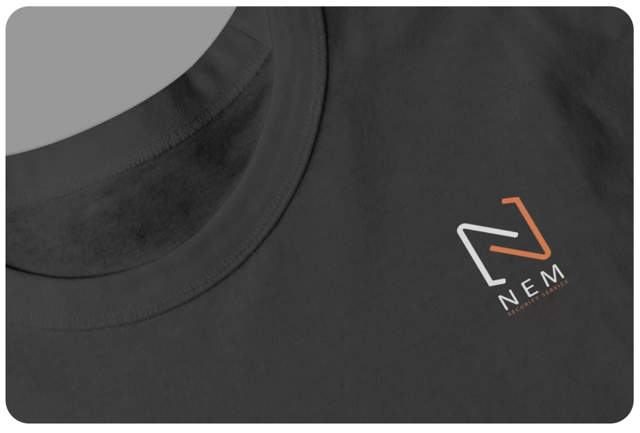
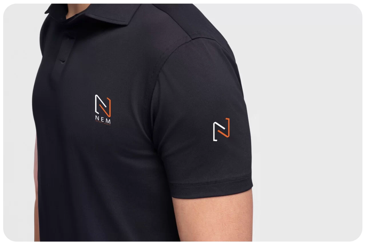
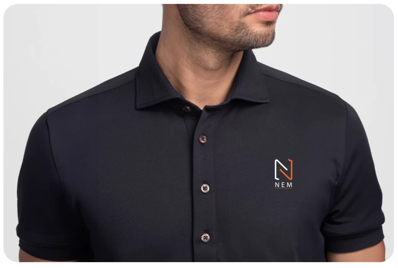
Following a rigorous selection process, this chosen emblem emerged triumphant, embodying the brand’s ethos and values. Real-world applications were explored by placing the logo on tangible elements, allowing the client to envision its impact in practical scenarios.
The culmination of this collaborative effort resulted in the client expressing utmost satisfaction with the final outcome, confirming the logo’s resonance and effectiveness in representing NEM Security Services.
We use cookies to ensure that we give you the best experience on our website. If you continue to use this site we will assume that you are happy with it.Ok